Most Amazon images are designed on a large monitor and judged by people sitting at a desk. Yet a large share of shoppers browse and buy on their phones, where the same image is a few centimetres wide, viewed at arm's length, often in daylight and usually while doing something else. An infographic that looks balanced and informative on a 27 inch screen can become an unreadable grid of tiny words on a phone.
This guide is about designing for that small screen. It covers how mobile shoppers move through images, how big text and icons need to be, how to arrange layouts for a narrow view and how to test before you upload. It does not cover what your overlay copy should say; that belongs to our guide on writing text for image overlays.

How Shoppers Use Images on a Phone
On desktop, shoppers see a row of thumbnails beside a large image and can hover to zoom. In the Amazon app and mobile browser, the image block usually becomes a full-width carousel. Shoppers swipe horizontally from one image to the next, with small dots or a counter showing their position. They can tap to open a full-screen view and pinch to zoom, but many simply swipe through quickly and then scroll down.
This changes design priorities in three ways:
- One image at a time. There is no thumbnail strip to preview what is coming, so each image must make sense on its own.
- Fast swiping. Shoppers give each image a moment, not a careful read. The message must land almost instantly.
- Small physical size. The whole image is roughly the width of the phone, so every element inside it is shrunk dramatically.
Amazon updates its app layout regularly and display behaviour can differ between devices and marketplaces, so always check how your own listing appears rather than relying on a fixed description.
The Squint Test for Text Size
There is no official minimum font size for Amazon images, so you need a practical rule. A useful starting point is to design on a 2000 pixel square canvas and keep headline text no smaller than roughly 80 to 100 pixels tall, with supporting text no smaller than roughly 45 to 60 pixels. These are working guidelines rather than Amazon rules, and the right size depends on the typeface, but they reliably produce text that can be read on a phone held at a normal distance.
The simplest test is to shrink the whole image to the width of a phone screen on your monitor, step back and squint. If you cannot read the headline instantly, it is too small or too weak. If you can only read the supporting text by leaning in, either enlarge it or cut it.
Typeface choices that survive shrinking
- Use clean sans serif typefaces with open letter shapes.
- Avoid thin or light weights, which disappear at small sizes; medium and bold weights hold up better.
- Avoid long lines of capitals, which are harder to read quickly.
- Leave generous letter and line spacing so words do not merge.
Fewer Words, Bigger Product
The fastest way to make an image mobile friendly is to remove things. On a phone, an image with one headline, a large product and two or three short callouts will communicate more than one with eight feature boxes. If you have eight features worth showing, spread them across several images rather than compressing them into one.
A practical limit is one main message per image and no more than three or four supporting points. Keep the product large, because on a small screen the product itself is the most recognisable element. Our guide to designing infographic images covers how to choose and structure that single message.
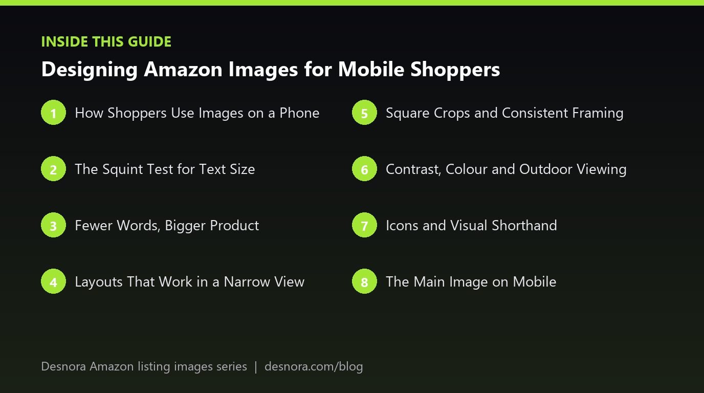
Layouts That Work in a Narrow View
Desktop designs often place text in thin columns on the left and right with the product in the middle. On a phone, those side columns shrink to slivers. Layouts that work better on small screens include:
- Top headline, product below. A bold headline across the top third and the product filling the lower two thirds.
- Product with three callouts. Short labels connected to the product by simple lines, positioned with plenty of space.
- Split image. A clean two-panel layout, such as a close-up and a full view, each large enough to read.
- Single big statement. One number or claim, such as a capacity or a size, shown very large beside the product.
Avoid placing critical text near the very edges of the image. Some views crop or round the corners slightly, and edges are where the eye pays least attention during a quick swipe.
Square Crops and Consistent Framing
Amazon accepts a range of aspect ratios, but square images tend to be the safest choice for the mobile carousel. A tall or wide image may be displayed with empty space around it, making the product smaller than it needs to be. Square images use the available area fully and keep the carousel looking even as shoppers swipe.
Keep the product at a similar size and position across all images where possible. When the product jumps from large and central to tiny and off to one side, the carousel feels disjointed. Consistency helps shoppers compare images quickly, which matters more on a phone than on desktop. For the pixel sizes and export settings behind these crops, see our article on resolution and zoom.
Contrast, Colour and Outdoor Viewing
Phones are used on trains, in kitchens and outdoors, often with brightness turned down to save battery. Subtle colour combinations that look elegant on a calibrated monitor can vanish in those conditions. Pale grey text on white, mid-tone text on a busy photo and colour-on-colour combinations of similar brightness are the usual culprits.
Aim for strong contrast between text and its background. When text sits on a photograph, place it on a solid or semi-solid panel, or choose an area of the photo that is plain and either clearly light or clearly dark. A quick test is to convert the image to greyscale: if text is hard to read in greyscale, its contrast is too low. This also helps shoppers with low vision or colour vision deficiency.
Icons and Visual Shorthand
Icons can carry meaning faster than words on a small screen, but only when they are simple and familiar. A water droplet for waterproofing or a battery for battery life works instantly. Complex custom icons with fine lines become unreadable smudges at phone size.
Pair each icon with a word or two rather than relying on the icon alone, keep icon line weights bold, and use a consistent icon style across the whole stack. Three large icons are more useful than nine tiny ones.
The Main Image on Mobile
The main image cannot carry text, logos or badges, so mobile design here is about the product itself. In mobile search results, the main image is a small tile among many. A product that fills about 85% of the white frame, shown from its most recognisable angle, is easier to identify at that size. Thin or long products often look tiny in a square tile, so consider angles that make better use of the frame while still showing the product accurately. Our article on main image best practices covers angle and fill choices in depth.
A Worked Example: Rebuilding a Blender Infographic for Phones
A small appliance brand had a features infographic for a personal blender. On desktop it looked professional: the blender in the centre, four feature boxes on each side, each with an icon, a heading and a two-line description. In total the image contained around 90 words.
When the team viewed it on a phone, the feature descriptions were unreadable and even the headings were difficult. The icons, drawn with thin lines, looked like grey dots. The product in the middle was small because the side columns took up so much width.
The redesign split the content into three images. The first carried one headline about blending speed in large bold type across the top, with the blender filling most of the lower area and two short callouts. The second focused on portability, showing the blending cup with its travel lid and a single line of text. The third covered cleaning, with a large close-up of the removable blade and three bold icons with one-word labels. Each image contained fewer than 15 words.
Before uploading, the designer exported the three images, sent them to their own phone and swiped through them at arm's length, then checked them again outdoors. One callout was enlarged after that test. The new images also looked cleaner on desktop, which is a common side effect of designing mobile first.
Testing on a Real Phone Before Upload
Desktop previews are not enough. Build a simple routine into every image project:
- Export final images at their real upload size.
- Transfer them to a phone and view them full width in the photo gallery.
- Swipe through them in stack order at normal speed and note what you remember.
- Hold the phone at arm's length and check every headline.
- Test with screen brightness lowered, and if possible outdoors.
- Ask someone unfamiliar with the product what each image is telling them.
After upload and processing, repeat the swipe test on the live listing in the Amazon app, because the app view, cropping and compression may differ slightly from your file preview.
Common Mobile Design Mistakes
- Designing and approving images only on a large monitor.
- Paragraphs of text inside images.
- Thin fonts and thin icons that disappear at small sizes.
- Low-contrast text on busy photographs.
- Critical details pushed to the edges of the image.
- Small products floating in large empty canvases.
- Inconsistent product size and position across the carousel.
Mobile Image Checklist
- Every image communicates one main message in a moment.
- Headlines are readable at phone size from arm's length.
- Supporting text is short and large enough to read without zooming.
- Fonts and icons use medium or bold weights.
- Text has strong contrast and passes a greyscale check.
- The product is large in every image.
- Images are square and framed consistently.
- Nothing critical sits at the edges.
- Images were tested on a real phone before upload.
- The live listing was checked in the Amazon app after upload.
Images that work on a phone usually work everywhere. If you would like your listing images designed and tested for mobile shoppers from the start, explore Desnora's Amazon listing image design service or contact us.
Frequently Asked Questions
Do Amazon images look different on mobile?
Yes. The images are the same files, but on a phone they appear much smaller, usually in a full-width swipe carousel, so text and fine detail that work on desktop can become unreadable.
What font size should I use on Amazon images?
Amazon sets no official minimum. As a working guide on a 2000 pixel canvas, keep headlines around 80 to 100 pixels tall or more and supporting text around 45 to 60 pixels or more, then test on a phone.
How many words should a mobile-friendly image have?
As few as possible. One short headline and three or four brief callouts is a sensible maximum for most images.
Should Amazon images be square?
Square is not required, but it uses the mobile carousel space fully and keeps the product as large as possible, so it is usually the safest choice.
How do I test images for mobile?
Export them at upload size, view them on a real phone, swipe through in order at arm's length and check them with brightness lowered. Then check the live listing in the Amazon app.
Can I zoom on Amazon images on a phone?
Yes, shoppers can usually tap to open the image and pinch to zoom, as long as the image is at least 1000 pixels on the longest side. Many do not, so key messages must work without zoom.
Why does my infographic look cluttered on mobile?
It probably carries too many elements for its physical size on a phone. Split the content across several images and enlarge what remains.
Do icons help on mobile?
Simple, bold icons with a short label help shoppers understand features quickly. Detailed or thin-line icons tend to become unreadable.
Does mobile design matter for the main image?
Yes. The main image has no text, but it appears as a small tile in mobile search, so a recognisable angle and good frame fill make it easier to identify.
Should I make separate images for mobile and desktop?
No. Amazon uses the same images on both, so design one set that works on a phone first and check it also looks good on desktop.
Where should text go in a mobile image?
Usually across the top or in clear space beside a large product. Avoid placing important text near the edges or over busy parts of a photograph.
How can I check text contrast quickly?
Convert the image to greyscale. If text becomes hard to read, increase the difference in brightness between the text and its background.