"Smaller than expected" is one of the most frustrating phrases a seller can read in a review. The product works, the quality is fine, and yet the customer is disappointed and may send it back. In almost every case the listing did state the dimensions somewhere, but the shopper either did not read them or could not picture what 18 by 12 centimetres actually looks like.
Dimension and scale images close that gap. They turn numbers into something a shopper can see and judge at a glance. This guide covers the two families of size images, measurement graphics and scale references, and shows how to design them accurately for each marketplace so fewer buyers are surprised when the parcel arrives.

Why Size Confusion Happens
On Amazon, the main image shows a product on a white background with nothing around it. A large storage box and a small trinket box can look identical in that format, because both fill around 85% of the frame. Lifestyle images do not always help either, because wide-angle lenses, styling and careful framing can make products look larger or smaller than they are.
Shoppers also skim. Dimensions in the bullet points or the product details table are easy to miss, and many shoppers never scroll that far on a phone. Even when they do see the numbers, most people are poor at visualising measurements. A size image is the safety net that catches all of these situations.
Two Kinds of Size Image
There are two broad ways to show size, and most listings benefit from both:
- Measurement graphics show the product with dimension lines and exact figures. They answer "will it fit?" precisely and suit shoppers who are measuring a shelf, a drawer or a body part.
- Scale references show the product next to something familiar, such as a hand, a person, a mug or a common device. They answer "how big does it feel?" intuitively and suit shoppers who will not read numbers.
The right balance depends on the product. Furniture, luggage and storage need precise measurement graphics. Jewellery, gadgets and small accessories benefit most from in-hand and on-body scale. Many products deserve one of each.
Designing a Clear Measurement Graphic
A good measurement graphic looks technical but simple. Show the product from a clear angle, usually straight on or at a slight three-quarter view, and add thin dimension lines with arrowheads or end caps along each measured edge. Place the figure beside each line in large, legible type.
- Measure the real product yourself rather than copying supplier figures, and measure at the widest points, including handles, feet or lids.
- Show height, width and depth, plus any measurement that drives purchase decisions, such as internal capacity, opening size or strap drop.
- Keep dimension lines clear of the product's key features so they do not hide details.
- Use a neutral colour for lines and a strong colour or weight for the figures.
- Label clearly what each figure is when it could be ambiguous, such as "internal width".
For products with variants, create a separate measurement graphic per size rather than one chart listing every size, unless shoppers genuinely need to compare them.
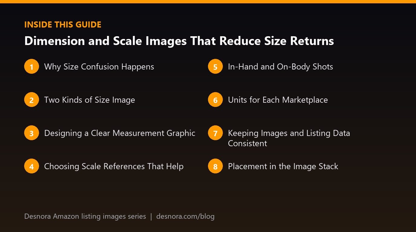
Choosing Scale References That Help
A scale reference only works if the shopper already knows its size. Good references are universal, consistent and relevant to the product:
- A hand for anything held, worn on the wrist or used with the fingers.
- A person for furniture, luggage, outdoor gear and anything sized relative to the body.
- A smartphone for accessories, bags and small electronics, shown generically without branding.
- A coffee mug, standard drinks can or A4 sheet for kitchen and desk items.
- A doorway, sofa or bed for rugs, mirrors and wall art.
Avoid coins and banknotes as the only reference, because they differ between countries and may not be understood by all shoppers. Avoid showing branded items as references; use generic objects or obscure any branding. Keep references in proportion: if you composite a product into a scene, its size must be accurate, not flattering.
In-Hand and On-Body Shots
For small and wearable products, a photograph of the product in a real hand or on a real body often communicates size better than any graphic. A pair of earrings on an ear, a wallet in a back pocket or a phone case held in a hand gives an immediate sense of proportion.
Choose a model whose hands or build are typical of your buyers. Very small hands make products look large, and the reverse is also true. Avoid wide-angle lenses close to the product, which exaggerate whatever is nearest the camera. Shoot from a natural viewing distance with a standard focal length so proportions look true. If you are planning a wider lifestyle shoot at the same time, our guide to lifestyle images covers casting and settings.
Units for Each Marketplace
Shoppers think in the units they use every day, and showing the wrong ones creates friction or confusion. As a general guide:
- United States: inches and pounds, often with metric in a smaller secondary position.
- United Kingdom: centimetres and kilograms are standard for most products, though inches remain familiar for screens, televisions and some clothing and furniture, so showing both often helps.
- European Union marketplaces: metric units.
- Japan: metric units.
- Canada and Mexico: metric is standard, though Canadian shoppers may also understand imperial for many products.
Showing both units is often the simplest solution, with the local unit first and larger. Round consistently and do not convert in a way that implies false precision; 30 cm is roughly 11.8 inches, not 12. Check category conventions in each marketplace's style guide, as these vary. If you sell in several countries, our guide to localising images for international marketplaces covers managing separate files per country.
Keeping Images and Listing Data Consistent
The figures in your size image must match the dimensions in your listing attributes, bullet points and any size chart. When they disagree, shoppers lose trust and returns become harder to dispute. Before upload, cross-check:
- Product dimensions in the listing attributes.
- Any measurements mentioned in bullets and description.
- A+ content modules that show size.
- The dimensions on packaging, if visible in other images.
Also make sure you are showing product dimensions, not package dimensions. Shoppers care about the item itself, and confusing the two is a common source of "smaller than expected" complaints.
Placement in the Image Stack
A size image is wasted if shoppers never reach it. For most products it belongs within the first five images, and where size is a known concern in your reviews or category, it should move earlier still. Our guide to sequencing your image stack explains how to rank buyer doubts and place answers accordingly. Remember that the main image cannot include dimension lines or text, so all size information must live in secondary images.
A Worked Example: A Bedside Organiser With a Size Problem
A home brand sold a fabric bedside caddy designed to hang between the mattress and the bed frame. The listing had a good main image and attractive lifestyle shots, but a steady stream of reviews said the pockets were "too small for a tablet" and some returns cited the item being "smaller than pictured".
Looking at the images, the team found that the lifestyle photo had been shot close up with a wide lens, which made the caddy look generous. The dimensions were listed in the bullets but in only one unit, and the measurement shown was the overall panel, not the pocket sizes that buyers cared about.
They created two new images. The first was a measurement graphic showing the caddy flat, with dimension lines for overall width and drop and, more importantly, the width and depth of each pocket, in centimetres first with inches beneath for the UK listing. The second was a scale photograph of the caddy hanging on a real bed with a generic tablet, a paperback and a pair of glasses placed in the pockets, shot from a natural distance with a standard lens.
The size images were placed in slots three and four. The bullet point was updated to list the pocket measurements as well. The team also recognised from the photos that a large tablet did not fit the main pocket, so the listing now said which tablet sizes fitted, rather than leaving shoppers to guess. Size-related comments in later reviews declined, and the honest statement about tablet fit meant fewer shoppers bought with the wrong expectation.
Common Size Image Mistakes
- Copying supplier dimensions without measuring the actual product.
- Showing package dimensions instead of product dimensions.
- Using only one unit in a marketplace where shoppers expect another.
- Scale references that vary by country, such as coins.
- Wide-angle lifestyle shots that exaggerate size.
- Composited scenes with the product scaled up to look impressive.
- Dimension text too small to read on a phone.
- Size images hidden in the last slot.
Dimension and Scale Image Checklist
- Measure the real product at its widest points.
- Include the measurements that drive purchase decisions, not just overall size.
- Create one clear measurement graphic per size variant.
- Add at least one scale reference, in hand, on body or beside a familiar object.
- Shoot scale photos at a natural distance with a standard focal length.
- Use the marketplace's preferred units, adding the secondary unit where helpful.
- Match figures exactly to listing attributes, bullets and A+ content.
- Show product dimensions, not package dimensions.
- Place size images within the first five slots.
- Check figures are readable on a phone.
Clear size images protect your reviews and your margins by setting the right expectations before purchase. If you want measurement graphics and scale photography designed for your listings, explore Desnora's Amazon listing image design service or contact us.
Frequently Asked Questions
Do I need a dimension image if dimensions are in the listing?
Yes. Many shoppers never read the dimensions in text, and most find it hard to visualise numbers. A size image shows them at a glance.
Can I put dimensions on the main image?
No. The main image must not contain text, graphics or dimension lines. Put all size information in secondary images.
Should I use metric or imperial units?
Use the units shoppers expect in each marketplace, such as inches in the US and centimetres in the UK and EU. Showing both, with the local unit first, is often the clearest option.
What is the best scale reference?
A hand or a person works for most products. Familiar objects such as a mug, an A4 sheet or a generic smartphone work well for desk and kitchen items.
Can I use a coin for scale?
It is better not to rely on coins alone, because they differ between countries. Use something universal such as a hand.
Should I show product or package dimensions?
Product dimensions. Shoppers care about the item itself, and showing package size is a common cause of "smaller than expected" complaints.
Where should the size image go in my stack?
Within the first five images for most products, and earlier if size is a frequent concern in reviews or questions.
How do I avoid making a product look bigger than it is?
Shoot from a natural distance with a standard focal length, avoid wide-angle close-ups, and never scale up a product when compositing it into a scene.
Do I need a separate size image for each variant?
Usually yes. Each size should have its own accurate measurement graphic so shoppers see the exact dimensions of the version they are viewing.
Which measurements should I include?
Height, width and depth, plus any measurement that affects the decision, such as internal capacity, opening size, pocket size or strap length.
What if my supplier's dimensions are wrong?
Measure the actual product yourself and update both the images and the listing attributes so everything matches.
Can a size image reduce returns?
It can help reduce returns caused by size surprises, because buyers know what to expect before ordering. It will not fix returns caused by other issues.